Movie posters can either make it or break it. Here are a few that make no sense to me as to why anyone would approve of such works of art which otherwise deserve better.
1. Pompeii
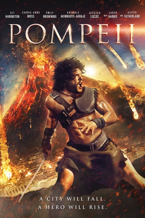
Kit Harrington is going to fight bare-bodied against an erupting volcano with his sword. Well, that’s what the poster seems to convey.
2. Independence Day
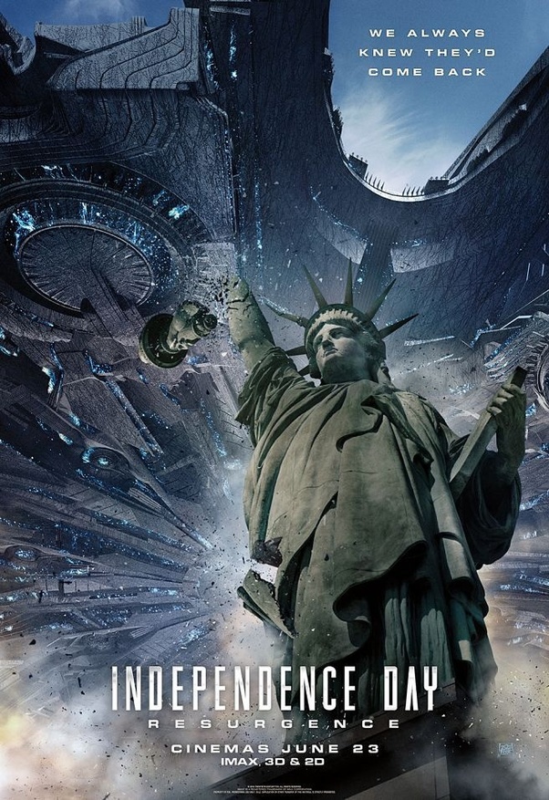
I have no words for this. I am totally convinced that the Photoshop guy was wearing a Blindfold while designing this.
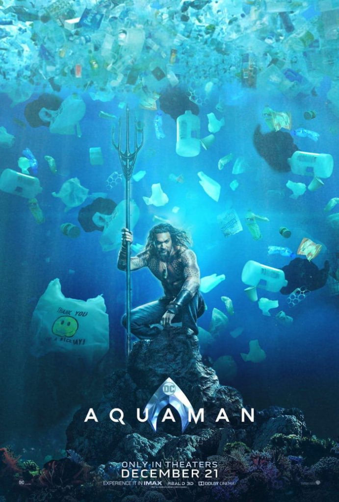
3. Aquaman
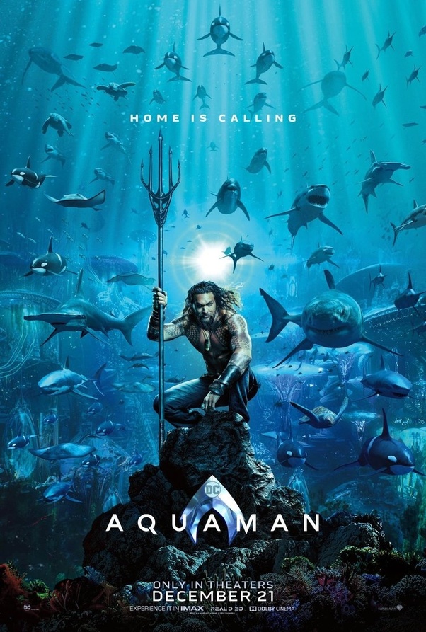
Countless memes of this one, one of the famous being–
4. The Departed
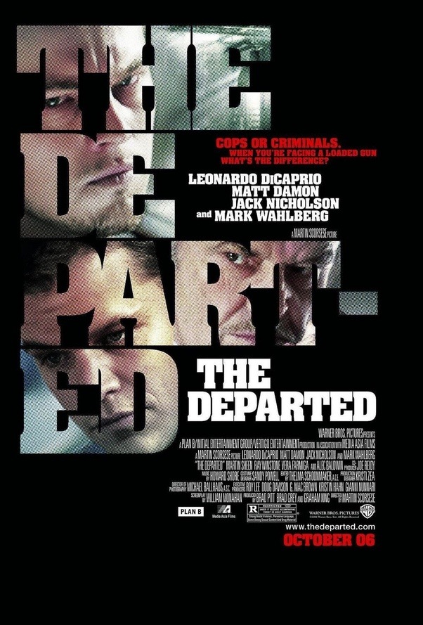
Brilliant movie, but trying to decode this poster can give you a migraine.
5. The Clapper

Looks like Ed Helmes was photoshopped onto the face of Steve Carrel. And Amanda Seyfried looks downright disgusting.
6. Planet of the Apes
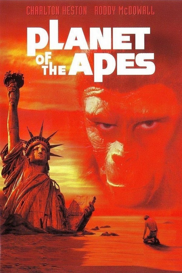
The poster is quite visually striking, however, it completely spoils the ending of the film.
The twist in the film (for those who don’t know) is that the Ape dominated Planet in which the astronauts have crash landed on is actually Earth in the future. The protagonist Charlton Heston discovers this when he sees the Statue of Liberty partially buried in the sand as seen in the poster. So what could have been a powerful twist ending was ruined by this poster.
7. Terminator: Genisys
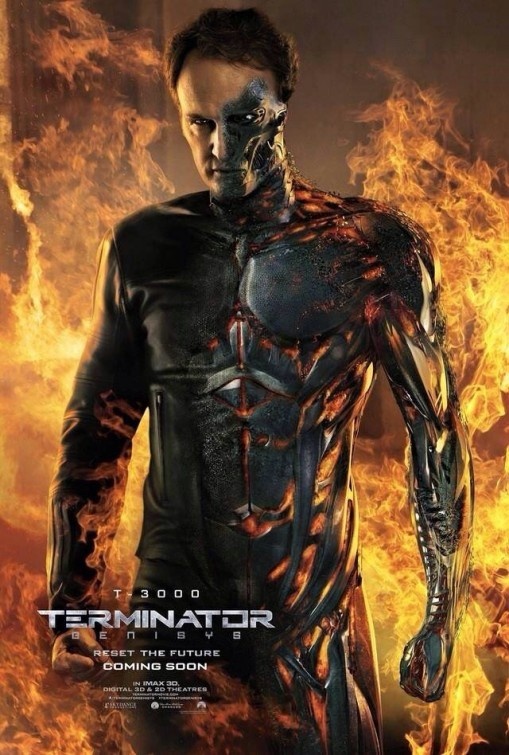
What’s the point of a poster that spoils the movie for you before you could watch it? Go ahead and watch it, you’ll know what I mean.
8. The Blue Lagoon
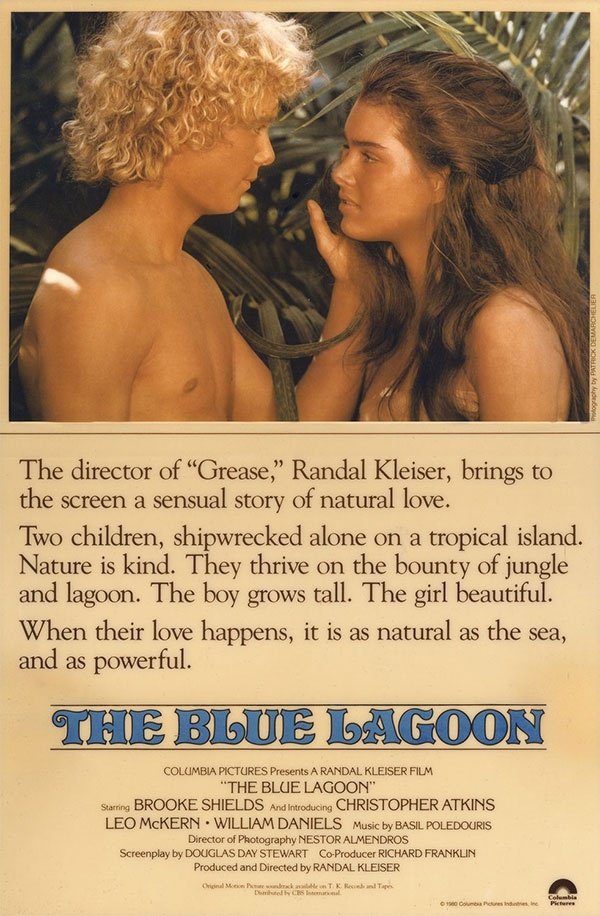
The movie poster for The Blue Lagoon uses 57 words to tell the audience that the movie is about two teens falling in love on a tropical island. Just the picture would have sufficed, I guess?
9. X-Men: Days of Future Past
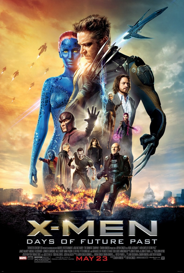
From the poster, it seems as if Professor-X’s fart caused an explosion.
10. The Accidental Husband
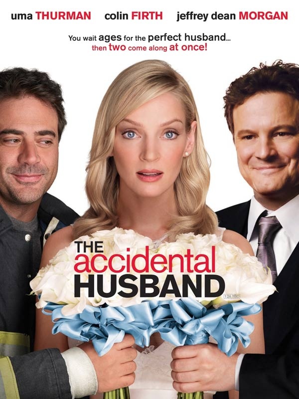
Just look at Colin Firth’s face (the guy on the right). Seems like he couldn’t make it to the shoot (or didn’t want to). Bad Photoshop apparently.
11. Dracula: Untold
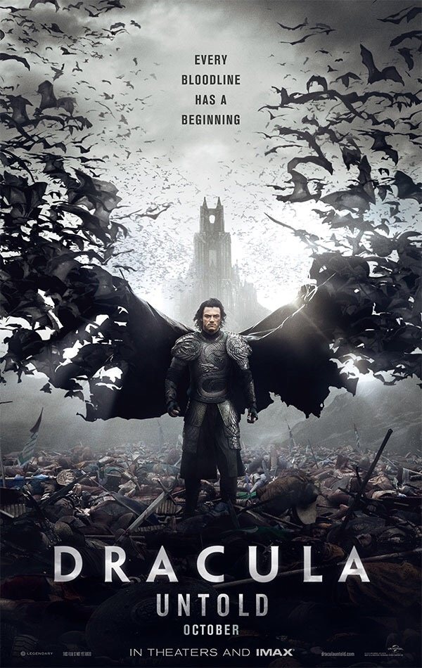
Great Poster but a pathetic rip-off of the Dark Knight.
12. The Heat
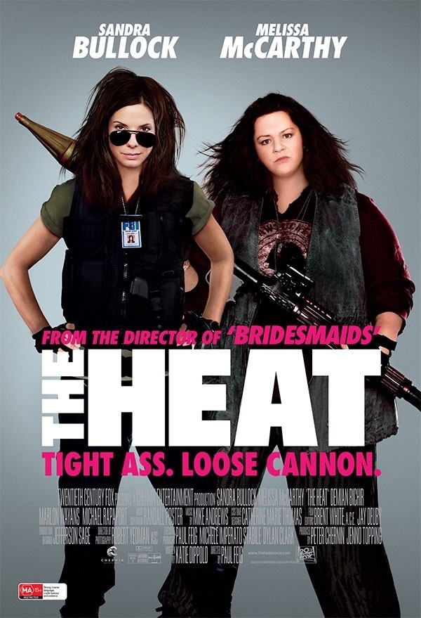
Look at Melissa McCarthy’s face and tell me if that looks normal to you.
13. Bangkok Dangerous
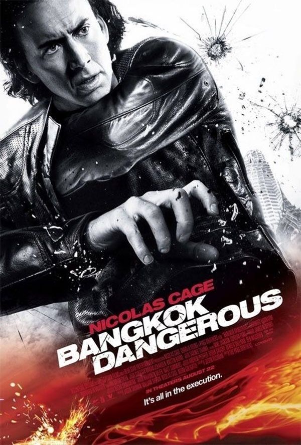
Okay, so MANY screw-ups in this one. First of all, his right hand in the front clearly seems to be holding a gun. However, for some reason, the designer decided to photoshop it out. And what is he reaching out for inside his jacket? No wonder Nicolas Cage’s movies go down the drain.
14. X-Men: First Class

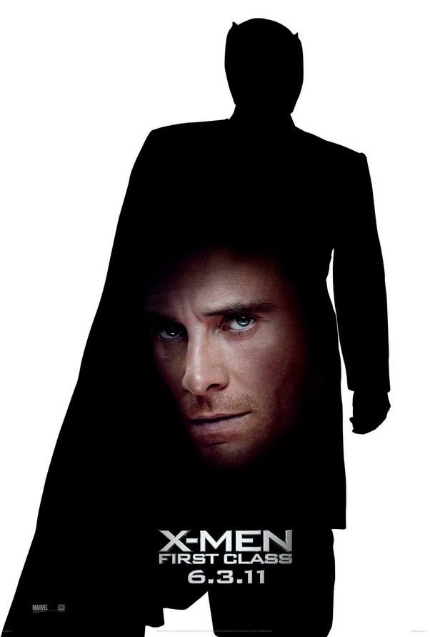
Lazy design, clueless execution, this poster can kill any excitement of seeing the movie. It was a prequel movie featuring James McAvoy playing a younger Professor X and Michael Fassbender as young Magneto. They wanted to connect two characters in the poster, but the execution was very bad ending up as an ugly mess.
15. Spiderman: Homecoming
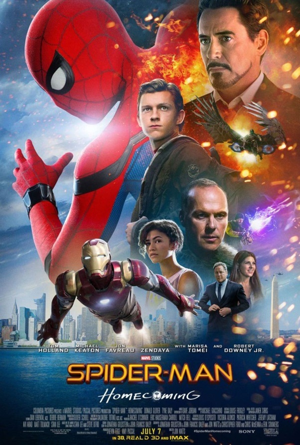
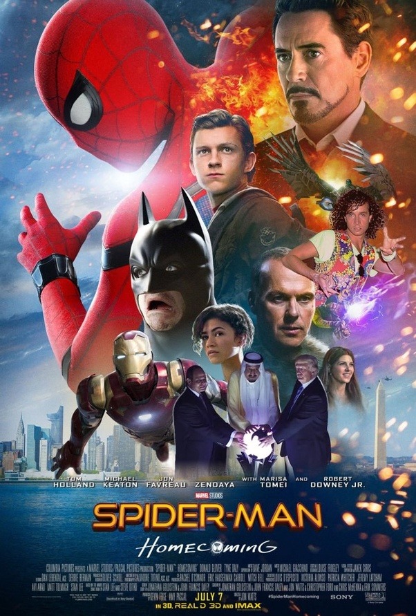
Why does Robert Downey’s face occupy a big chunk in the poster when his screen-time in the movie is less. The poster is so out of its way that it inspired spoofs like the one below–
16. Cook-off
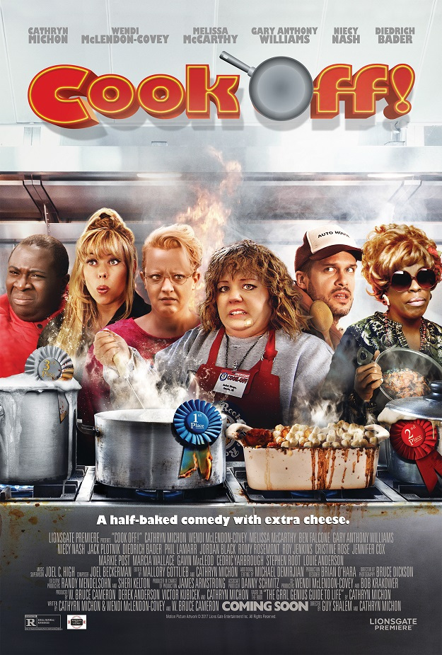
Forget about the movie. See if you can stomach this poster first. Mellisa McCarthy’s face looks like a muppet, everything in the poster looks gross, especially that’s been cooked on the right burner.
Have I missed any other posters? DO let us know in the comments!




GIPHY App Key not set. Please check settings